Adjusted Return Chart (J)
Introduction
Navigating the intricate world of trading requires effective tools. The J Chart, specifically designed for back-testing and analyzing historical trading strategies, emerges as an indispensable tool. It’s not just about viewing data; it’s about making informed decisions. Here’s your complete guide.
What’s the J Chart?
Unlike regular technical indicator charts, the J Chart serves as a reflection of trading outcomes between the red and green tickers displayed in the FT Cloud chart. In essence, it visualizes the results of deploying a particular technical indicator, helping traders retrospectively gauge the efficiency of their trading strategies.
Core Aspects of the J Chart:
- Nature of the Chart: The J Chart isn’t a typical technical indicator. It neither generates buy/sell signals nor requires parameter setting. It shows the results of buying and selling based on an indicator.
- Visual Elements:
- The red line mirrors the T Chart‘s red line.
- The chart’s multicolor line (or alternating red-green segments) represents combined returns from trading the red and green line, based on the indicator cues from the chart above it.
- Clicking on the chart label displays values spanning the entire chart, independent of pole positions.
Why Embrace the J Chart?
- Efficient Strategy Review: J Charts seamlessly allow you to evaluate a trading strategy’s efficacy. Paired with funds and a single-day delay, they depict exact earnings a real investor could achieve.
- Investment Strategy: This tool is particularly crucial for strategies that emphasize staying fully invested in the assets spotlighted on the T Chart.
Deploying the J Chart
Timing with the J Chart
The J Chart offers a nuanced perspective on the influence of timing over a traditional buy-and-hold strategy. Let’s unpack this using the provided example:
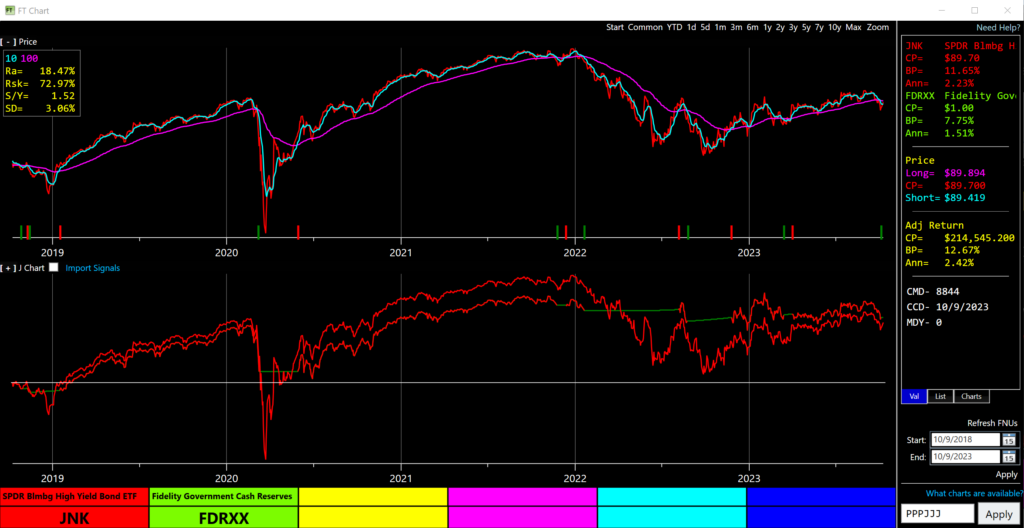
In the showcased image, we’ve employed a strategy to trade the junk bond fund JNK against the money market, relying on a 10-day short moving average coupled with a 100-day long moving average. Here’s how the mechanics unfold:
- When the short-term average slips below the long-term, the cue is to pivot towards the money market.
- Conversely, once it edges back above, the move gravitates to investing in JNK.
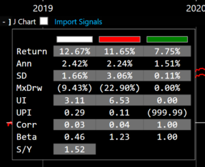
Over a span of three years, the returns paint an intriguing narrative. While JNK yields 11.65%, the adjusted return strategy slightly edges ahead at 12.67%. However, it’s the journey to these figures that brings the true value of the J Chart to light.
In a side-by-side comparison:
- Drawdown: The adjusted return trajectory (illustrated in white) experiences a significantly softer dip, recording a 9.43% drop. In stark contrast, JNK alone faces a steeper decline at 22.9% within the same timeframe.
- Volatility: The story gets even more compelling here. The adjusted line showcases far steadier moves, slashing the standard deviation to a mere 1.66% monthly. JNK, on the other hand, witnesses a more tumultuous ride, registering a volatility of 3.06% monthly.
This analysis underscores the essence of the J Chart – it’s not merely about end percentages, but about the journey’s quality and the risks undertaken to reach those outcomes. With the J Chart’s insights, traders can aim for returns while cushioning against drastic market ebbs and flows.
For Selection
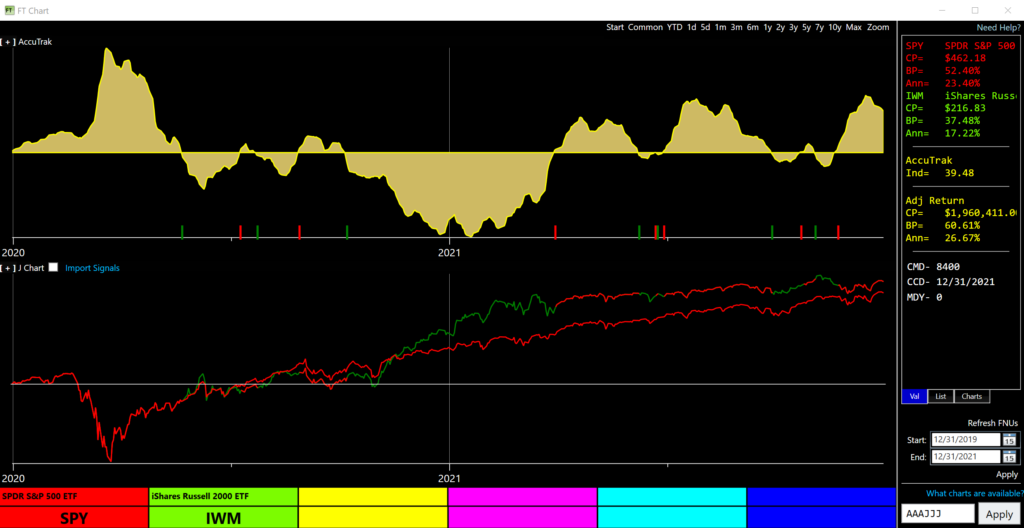
The chart’s primary use is for picking between two issues. An exemplary strategy showcases switches based on the strength differentiators of the S&P 500 fund (SPY) and the Russell 2000 small cap fund (IWM). The insight? It reveals the small cap’s outperformance 4Q2020 to 1Q2021 relative to large caps.
Enhancing the J Chart’s Usage:
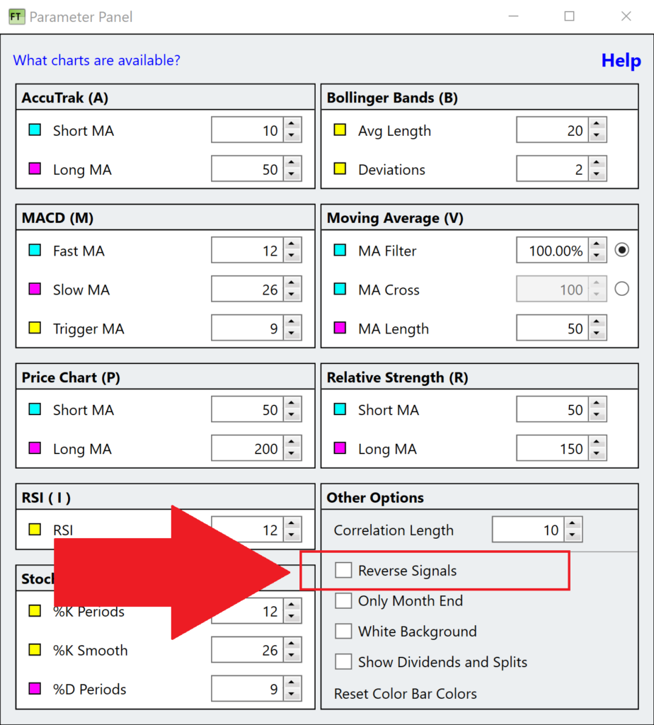
- Reversing Signals: You can flip the red and green signals by accessing “Parameters” after right-clicking the chart and checking the “Reverse Signals” box. This technique is beneficial for trading a trendless issue.
Some Caveats:
- The Limitation of Timing: Pure timing, though reducing risk, might not consistently outperform a buy-and-hold strategy in the long run.
- Chart Limitations: Trading between market segments flourishes when segments exhibit distinct price movement characteristics. When using the J Chart, ensure both lines are similarly volatile. If there’s a significant disparity, the more volatile line can dominate, making the J Chart function like a smoothed moving average.
Conclusion:
Armed with the J Chart, traders have a powerful tool to retrospect and refine their trading strategies. Whether you’re a seasoned trader or just starting, understanding and leveraging the J Chart can set you on a path to more informed and strategic trading.
The J Chart shows the results of trading the technical indicator displayed in the chart directly above the J Chart.